
In this article, I’ll talk about the process of building Merengue. This React component library helps developers implement a page grid and build their page layouts quickly without worrying about CSS rules.
Motivation
The development of Merengue started as an effort to offer a way to allow content editors to customize page designs, and move and position elements even if the CMS does not offer an integrated tool for that purpose.
Custom-made and headless CMSs could benefit from this library to allow content editors to build different pages with a high level of flexibility.
Initially built as part of a bigger component library, the essence of the tool was then extracted and published as a set of small React components. Merengue takes out of the equation definitions of typography, colors, and imagery, and focuses on the challenge of providing a consistent, yet flexible, page grid – a minimal but powerful resource to organize the elements of the page while not interfering with other design definitions.
The development of Merengue library intends to provide the following:
- A quick way to structure pages while keeping the grid settings consistent;
- No interference with other page design elements;
- Flexibility to render any custom components inside the grid blocks;
- Accessibility-friendly components, that allow you to define the DOM elements that build the grid through polymorphic components;
- Server Components compatibility;
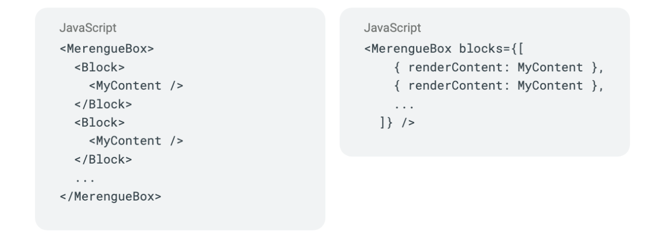
- Possibility to dynamically build the grid of the elements by representing them as an array of objects.
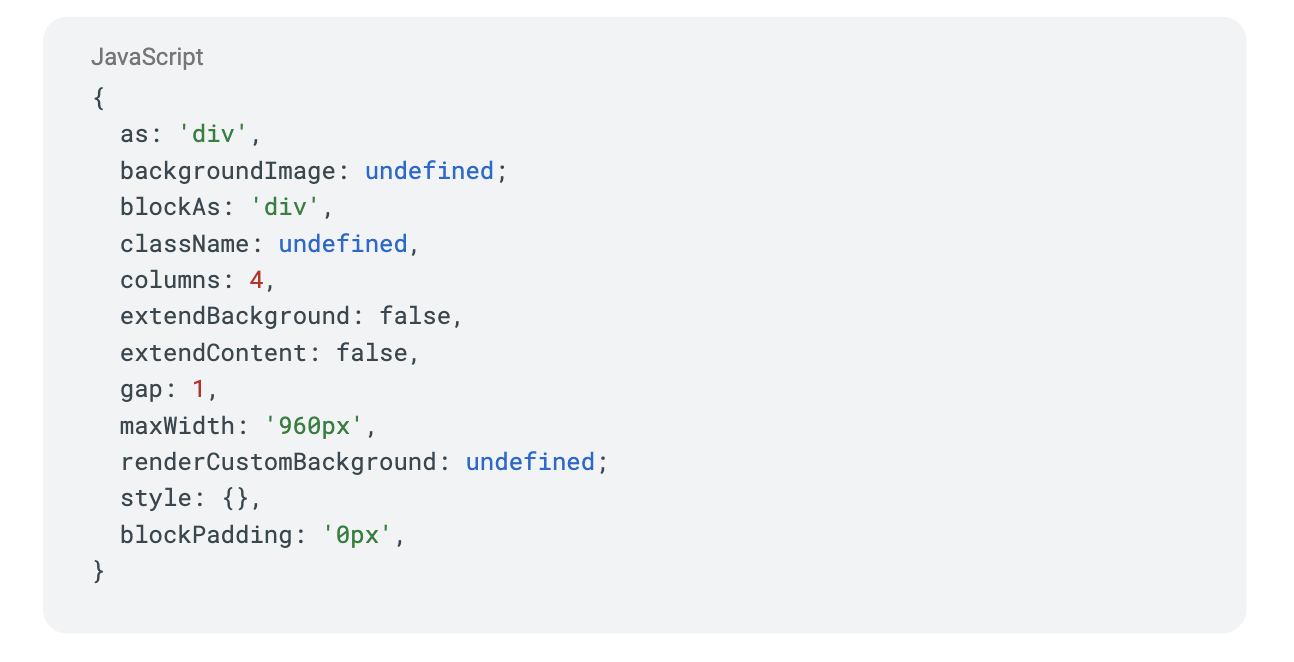
With Merengue is possible to build a grid using the default settings out of the box as in the example below. All the options are documented in more detail here.
The default settings are:
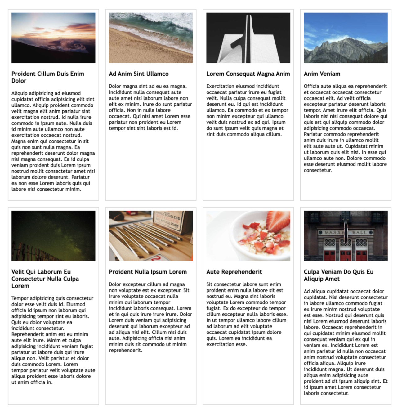
This will render a grid of 4 columns of the same size, like below:
Context
Definition
A page grid is a system of columns and rows that helps align elements on a webpage and create a sense of balance and unity. This can improve the user experience by making the page look more organized and visually appealing.
The page layout is commonly referred to as a group of defined areas where the content will fit, e.g. header, menu, sidebar, footer.
Note that as of today there is no one way to represent either a page grid or page layout when it comes to HTML or CSS. It’s up to the developer to translate the design definitions as code, making sure to consider other topics such as responsiveness and accessibility along the way.
Fundamentally, the page should be built exclusively with the DOM Elements required to represent the content, while the layout and grid are design concepts that won’t be understood by the browser but rather by the user.
Possible solutions
I’ll go through some of the approaches used to represent page grids and layouts, looking briefly at each one.
Legacy methods
- Tables
While tables were once commonly used to implement page layouts, their extensive markup and poor responsiveness make them a less attractive option today.
Tables can build mostly fixed, boxed layouts, configured by a set number of rows, columns and the cells where they intersect. The markup can quickly become convoluted with nested tables. Also, the method offers low to no responsiveness support and bad accessibility.
Tables are not the norm for modern websites anymore, and their use should be limited to the extent of what they were designed for: a great method to display two-dimensional data.
- Float
The float property in CSS allows for greater flexibility in positioning layout elements, but it can feel like a workaround. It was not originally designed for page layouts and may not behave as expected when used for that purpose.
The float property in CSS allows floated objects to be taken out of the normal flow and pushed to the left or right while other elements flow around them.
While the use of the float property enables much more plasticity than tables, it most often feels like a workaround to implement a design with this approach, and making responsive layouts with it can be challenging.
It’s worth noting that the float property was not originally developed to build page layouts, and therefore may not behave as expected when used for that purpose. However, there are specific scenarios where floats can be used effectively, such as for image galleries or wrapping text around an element. By understanding the strengths and limitations of the float property, developers can use it effectively as part of their frontend toolkit.
In its simplest use, the float property can be used to wrap text around images.
CSS Flexible Box Layout Module
The CSS Flexible Box Layout, also known as Flexbox enables flexible and responsive layouts in CSS.
It offers a straightforward way to arrange elements on a page, making it easier to create complex and responsive web designs. Flexbox allows developers to control the alignment, direction, order, and sizing of elements in a flexible manner.
The flexbox module is a W3C Candidate Recommendation and is commonly supported by all major modern browsers.
“The Flexible Box Layout Module makes it easier to design flexible responsive layout structures without using float or positioning.”
With a set of different properties, it’s possible to achieve great control and flexibility with the way elements should be positioned, and compose the page layout.
CSS Grid Layout Module
The CSS Grid Layout module is a powerful layout system that allows for complex two-dimensional layouts in CSS.
Currently, a W3C Candidate Recommendation Draft the CSS Grid method enables high flexibility in how columns and rows are configured, allowing for a complex setup of the page layout, even including named template areas and gap configuration.
CSS Grid is a comprehensive method that has already been adopted by all major browsers.
Both Flexbox and CSS Grid are good options to build a page layout. This article from MDN Web Docs lays out the differences between the two approaches – to summarise I can say that the main differences are:
- Flexbox has a one-dimensional approach while Grid has a two-dimensional take on the rows and columns.
- Flexbox is ideal when the content size affects the space taken by the item on the row (or column), while grid is better when we want the content to adapt to the definitions of the rows and columns.
Merengue Grid
Considering the initial goals, the chosen method was to use CSS Grid and abstract some of the options the method offers to React components that can be used out of the box, minimising the need for configuration. But there’s of course many other choices to make when building a library. I’ll go through these and quickly look over the reasoning behind the choices made.
TypeScript
Built with TypeScript, a superset of JavaScript, the intention was to improve the developer experience when developing and consuming the library.
CSS Modules & SASS
The initial iteration was built with the help of Styled Components, a popular and very powerful CSS-in-JS library. However, using it made it necessary either to distribute the library with styled components or to require it as peer dependency.
Also, I wanted to make the library fully compatible with Server Components and although Styled Components supports concurrent server-side rendering, the component styles still need to be rehydrated on the client.
For these reasons, I’ve opted for CSS Modules, which simply output the CSS files that will style the Server Components. CSS Modules are one of the recommended approaches to style Server Components by Next.js.
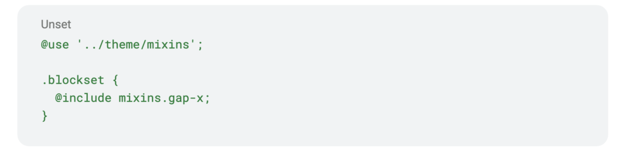
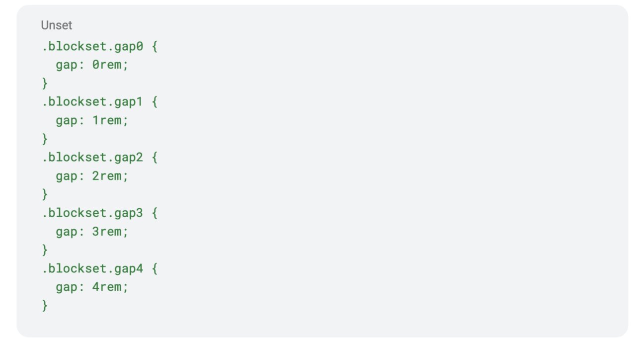
On top of that, with the aid of SASS (a preprocessor scripting language and a superset of CSS) it was easier to develop all the different variations needed to offer Merengue grid with a good number of options. All the classes that generate different gap and column rules are generated with useful mixins.

Mixin that generates a list of CSS rules based on variable $gap-max
Example usage of the gap mixin
CSS generated
Polymorphic components
Polymorphic components are a special kind of component that allows users to choose which DOM Element they will output. This practice is common in libraries such as Styled Components and MUI (Material UI).
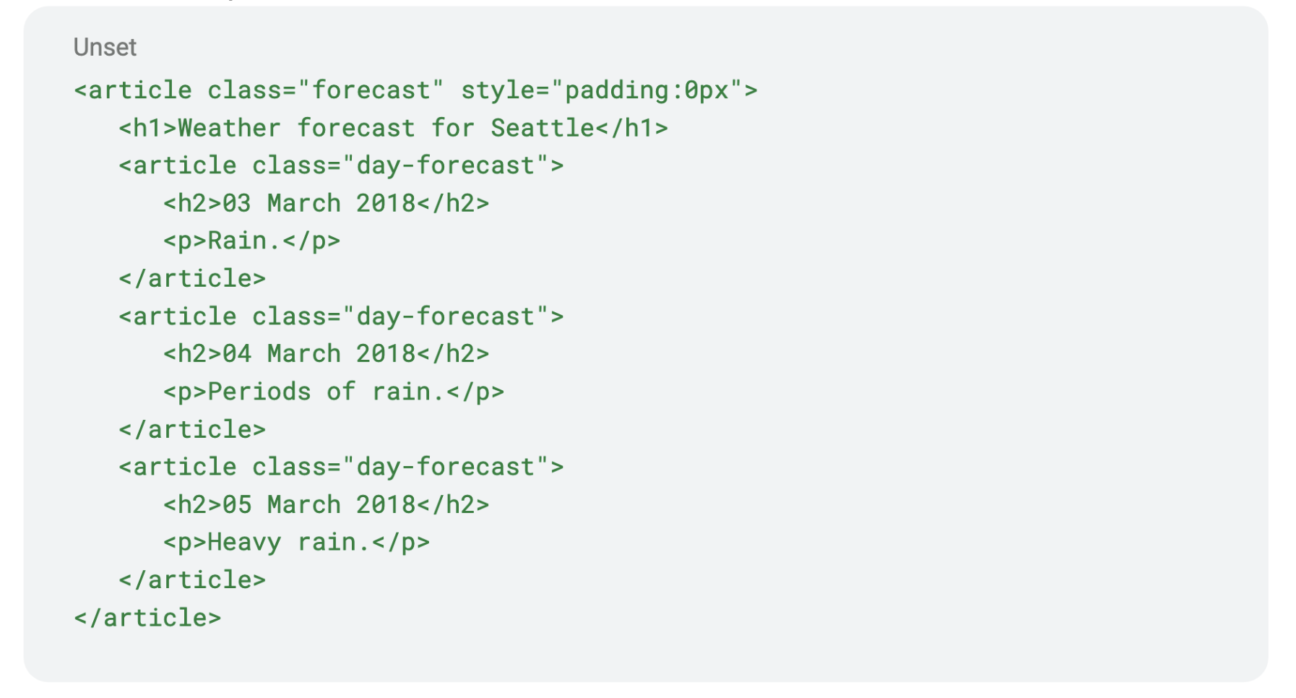
This example article from MDN Docs could be written as the following using the polymorphic Block component:
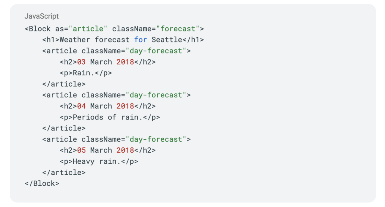
And output the exact same HTML:
Semantic HTML
Being able to choose the right HTML element is especially useful when creating accessibility-friendly pages, where the elements are meaningful and descriptive of the content they present.
Beyond improved accessibility, semantic HTML also has a positive effect on SEO and is easier to maintain.
Properties validation
Depending on the chosen element, different attributes will be acceptable and
a polymorphic component needs to account for that too. With TypeScript it’s possible to create dynamic types that will validate the properties based on the value of another property.
In the example below the block should be rendered as an article element. The article won’t support properties such as ‘alt’, designed to describe images, and TypeScript will let us know..


Polymorphic Ref:
In React, the ref property represents a way to imperatively modify or interact with a child component outside of the typical data flow. Even though there are only a handful of cases where the use of ref is really necessary, it’s not possible to predict how the Merengue components will be used, and therefore this feature should also be fully supported.
Refs provide a way to access DOM nodes or React elements created in the render method.
The ref type can be different for different HTML elements. For that reason, the type of ref should also depend on the type of element passed via the ‘as’ property.

Creating the ref

Using the ref with different types

The error TypeScript outputs

The type definition of PolymorphicRef
This very detailed article is a good reference for building strongly typed polymorphic components and handles all of the issues commented on above.
Server components
Published at the end of 2020, the concept of Server Components (or zero-bundle-size components) was introduced to the public with a very informative presentation available on React’s blog. Currently, the feature is still in development and it’s experimental in React, but support for its newest implementation is already included with Next.js 13, released in October 2022.
The main goal of Server Components is to reduce the bundle sent to the client by keeping as much as possible on the server, drastically improving the initial page load. They also allow direct access to backend resources and the use of sensitive information such as tokens or secrets.
But they do have some limitations. Server components do not have access to life-cycle effects, state, interactivity events or browser-only APIs.
To make sure the library components were compatible with Server Components (as described by Next.js 13) I had to make sure not to depend on any of these features. This meant not using a context provider to theme it and not depending on complex CSS-in-JS libraries for styling (not generating CSS on runtime).
Creating a theme without the use of React Context API
One of the most common methods of sharing theme options between components in React is to use the Context. Context is a way of making properties available to a tree of React components without the need to pass them down to each child component individually. Defining a context provider at a high level of the tree makes it very easy to maintain it. It is also the method used by Styled Components and many other libraries that allow theming.
However, since Server Components have no React state, it was necessary to find a different solution to make the theme options available without prop drilling. Instead, I’ve created a singleton (a globally accessible class with only one instance) and allowed properties to be set and read from it by tree components.
The theme has default values for its properties that get merged with the definitions passed to the entrypoint component, MerengueBox. These values are then read by other components, helping them choose different class names and define a couple of inline styles.
In the example below the BlockSet component reads the theme options object to define the CSS rules that will be used.
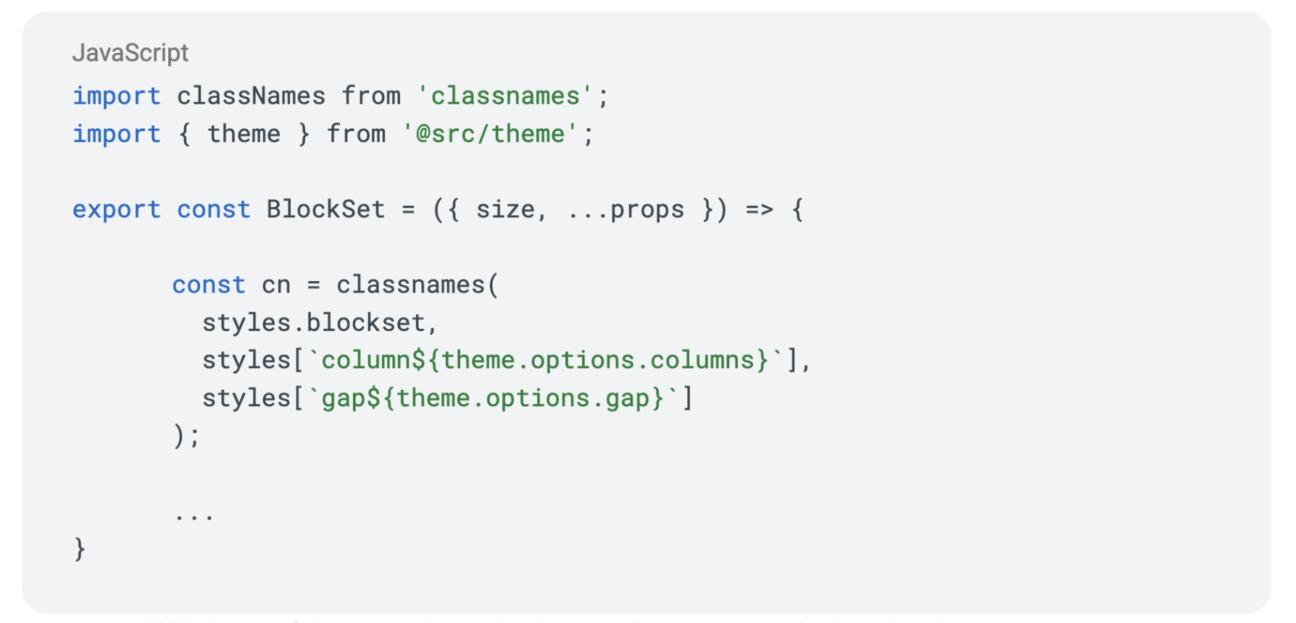
With the use of classnames it was simpler to conditionally apply rules based on the component props.
Parcel
The choice of a method to build the library was also something I invested some time to research. For this library the best choice was Parcel, as it offered support for TypeScript, CSS Modules and all default configurations out of the box. Let’s go through some term definitions to understand this decision better.
Compiler
A compiler is a tool that transforms high-level code into low-level, that the machine understands. When it comes to javascript, modern browsers execute the JIT (just-in-time) compilation with their own engines, often giving the impression that they simply execute javascript.
But when I say “javascript” it is important to consider that javascript has many versions, and the features available in the different versions might not be supported by all browsers. For this reason developers often compile modern javascript to make it compatible with most browsers while keeping the developer experience of newer versions.
For Merengue the compiler of choice is SWC, a modern and fast compiler written in Rust.
SWC is an extensible Rust-based platform for the next generation of fast developer tools. It’s used by tools like Next.js, Parcel, and Deno, as well as companies like Vercel, ByteDance, Tencent, Shopify, and more.
Transpiler
A transpiler is a program that will transform the code written in one high-level language into another. In the javascript context it’s often used to transform TypeScript into ECMAScript (regular javascript).
Even though SWC can also act as a transpiler on its own, I’ve opted to use a more complete solution that could handle CSS modules. Parcel uses SWC as its default compiler and transpiler, and comes with Lightning CSS solving both requirements.
Bundler
Bundler is a tool capable of combining assets together. Parcel acts as a bundler that can output different types of module systems, CommonJS or ES Modules. When developing a library meant to be consumed by other React applications, I’ve decided to distribute it as ES Modules only.
Ladle
While developing and testing the components of Merengue I’ve decided to use Ladle, instead of the most common Storybook. Ladle is incredibly fast and requires zero configuration to work. At the same time it offers all necessary resources to test and exemplify the variations of each component.
Conclusion
In this article, we’ve discussed various methods for creating page grids, and the pros and cons of each. I’ve also introduced Merengue, a new React component library for building page grids, and discussed some of its features and benefits.
Merengue is published as a npm package and its source is available publicly on Github. Even though it’s a small React component library to solve a very specific problem, a lot of work and dedication has been put into it in the hopes that it will help other developers who have faced similar challenges.
The process of developing a public library per se was a very good learning exercise and being able to share the outcome is extremely rewarding.
If you’re interested in trying out Merengue, check out the documentation on GitHub, and feel free to share your questions or feedback.

